| Anchor | ||||
|---|---|---|---|---|
|
November 20, 2023 (version 23.11.1)
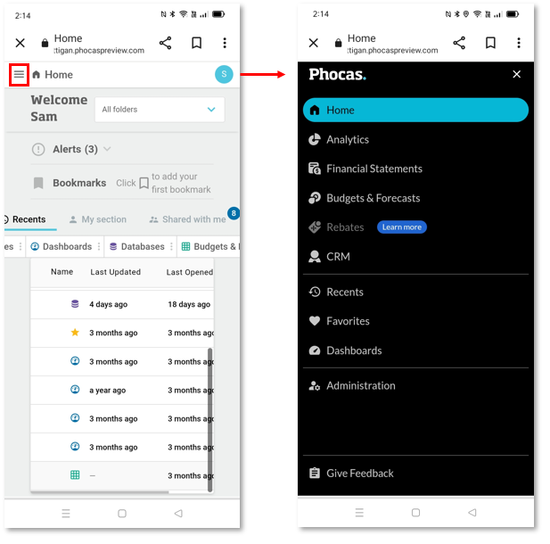
We updated the mobile version of Phocas to support the new navigation changes we released in September. When viewing Phocas on a mobile device, you’ll notice the new, simplified layout. The side menu is initially hidden, and accessible via the button in the top-left corner. We are currently working on a mobile-friendly version of the homepage.
We also resolved several issues and continue to be busy working on exciting new features.
October 23, 2023 (version 23.10.1)
We are busy working on exciting new features but made the following small changes:
We added the word Account to the title of what was previously called the Settings page, as Account settings is a more descriptive title and matches the label in the user menu.
We removed the page title and icon that were displayed on product homepages.
We updated the fonts we use in the new side menu.
For menu items that have long names that become truncated, tooltips now display the full name.
October 9, 2023 (version 23.9.2)
We are letting the dust settle after the release of the new side menu, so we have nothing new to release this time. We resolved some small issues and have been reading your feedback and planning our next work items.
| Anchor | ||||
|---|---|---|---|---|
|
| Status | ||||
|---|---|---|---|---|
|
New and enhanced features
| Panel | ||
|---|---|---|
| ||
WELCOME TO A NEW WAY OF NAVIGATING PHOCAS! |
In this release, we’re excited to launch a fresh new side menu to help you get around Phocas more easily and find all your important tools and data in a sleek, collapsible menu. We made some other navigation changes to simplify your screen and bring common actions closer to where you need them.
Here’s a short overview:
Side menu
Access modules from here - Analytics, Financial Statements, Budgets & Forecasts, Rebates and CRM. If you have permission to use a module it will appear in the list.
Open recents, favorites and dashboards.
Access the administration menu directly from the side menu. Manage users and databases, configure your Phocas site, and more.
Find what you’re after, with the ability to filter per module, or in recents, favorites and dashboards - all from the side menu. This replaces the Navigate to search box.
Quick access to common actions
From a database, click the blue expand arrow next to a database or favorite name to perform common actions such as saving a favorite, setting a default view and adding content to a dashboard. This replaces the ‘actions/star’ menu that was in the old top bar.
Help
Access help and learning resources directly in Phocas by launching the Resource Centre near the bottom on the side menu. This contains in-product interactive tours, short videos and links to learning resources.
We’ve decluttered the workspace by removing old ‘hover’ links to the product documentation, which turned on for some modules but not others. Links to the documentation for all the modules can be accessed from the Resource Center.
For more information and FAQs see Find your way around Phocas
Resolved issues and other changes
Change in version numbering. We have changed to a date-based version numbering system that is easier to understand. It's based on ‘Year/Month/Release Number’, which means you can easly see the month (and year) a version was released, and specific version number. For example, the version released on 20 September, 2023 is version 23.9.1.
We resolved other small issues.
| Anchor | ||||
|---|---|---|---|---|
|
New and enhanced features
We have been busy researching and developing new features, so we have nothing new to release this time.
Resolved issues and small changes
We made some substantial performance improvements to the nested grid - when you expand all, the data loads much faster than before.
We made performance improvements to the Summary widgets on dashboards - these widgets load faster than before.
We made headers more consistent across modes by making them double-height in Period, Variance and Moving Modes.
August 21, 2023 (version 8.1.31)
New and enhanced features
We finished updating our chart library, which now gives you a better mobile experience.
Resolved issues and small changes
We fixed a formatting issue with empty (zero value) cells that occurred in some Excel exports. These cells are now highlighted blue as expected.
August 7, 2023 (version 8.1.30)
New and enhanced features
Chart enhancements - We made the following two enhancements:
Ability to show, hide and position the legend - The new Legend position setting gives you four options for where to display the legend, relative to the chart. It also gives you the option to hide the legend from view.
New colors - We updated the chart color shades to improve contrast and overall legibility and accessibility.
Month to Date enhancement - We extended the Month To Date option to more modes. This option is now available in the following circumstances:
In Summary view: Period and Stream modes.
When a dimension is selected: Variance, Stream, Period Stream, Period Variance, and Matrix Variance modes.
Resolved issues and small changes
We fixed an issue with the Month to Date option whereby the values for the previous period in Stream mode were incorrect.
We fixed an issue with custom mode whereby the totals were broken for columns using placeholders in the name.
July 17, 2023 (version 8.1.29)
New and enhanced features
We have been busy researching and developing new features, so we have nothing new to release this time.
Resolved issues and small changes
We resolved several issues, including one that occurred when you tried to switch from a chart to the nested grid view. The nested grid now loads as expected.
June 19, 2023 (version 8.1.28)
New features and enhancements in the nested grid
Ability to resize and reorder columns - You can now change the width and position of the columns in the nested grid. This enhancement allows you to set up the grid to meet your analysis needs - you can view all the important information, in the optimal position.
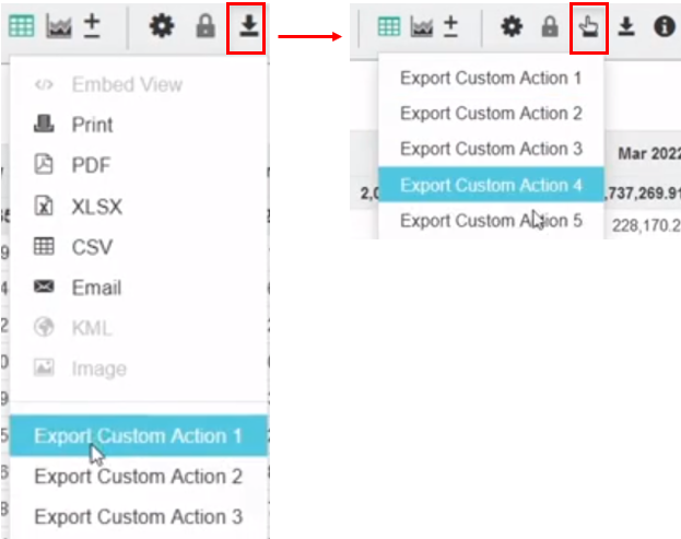
Enhancement to exports - We made the following enhancements and fixes to the export functionality in the nested grid:
We enabled three additional export file types options: Embed View (HTML), Print and Email.
We enhanced the XSLX exports; they now include subtotals and you can expand and collapse the rows.
Resolved issues and small changes
We resolved an issue whereby HTML subscriptions in the nested grid were failing. These subscriptions now work as expected.
We retired the survey that displayed when you exported in XSLX format. We got a huge response with very useful feedback that we will incorporate into future product developments. Thanks to all of you who participated.
We fixed an issued whereby incorrect periods were displaying when Moving Mode was selected in Summary view.
We fixed an issue that occurred when the Limit Rows option was used in a defined Measure and the corresponding dashboard widget did not load correctly.
We fixed an issue whereby an error displayed when Custom mode > Total Summaries were used in the nested grid.
May 22, 2023 (version 8.1.27)
Enhanced feature - nested grid
Do you use the nest feature? It’s now even better than before! The nested grid allows you to add up to four levels to the grid, creating a ‘nested’ view of the data. This makes it easier for you to review the contribution of different items within the overall results. It’s also a great starting point for creating reports, as you define the hierarchy of the data. We revamped the nested grid to give it a fresh new look, and introduced the ability to to expand or collapse all rows in the grid.
The new look design includes:
Different alignment, spacing, indentation and use of bold font, to make it easier for you to view the different levels of data.
New icons on the Expand and Collapse buttons that are consistent with those in other areas of the product.
New Expand/Collapse All button in the top left of the grid.
A lighter blue shading for selected rows.
Resolved issues and small changes
We fixed an issue with the Quarter and Weeks custom periods, an error message no longer displays when a dimension was selected and the query loads as expected.
We fixed an issue that occurred when viewing transactions from Custom mode; the Transaction mode page loaded with an incorrect period, or did not load at all and an error message displayed. Transaction mode now loads and displays the data as expected.
April 17, 2023 (version 8.1.26)
Enhanced feature - Exports
We replaced the Export dropdown menu with a new window, in which you select the required export format (Print, XLSX, CSV, email and so on). Depending on the format you select, you might see additional customization options.
To help us improve exports in Analytics, if you select the Excel option, you’ll see a short, optional survey. We are interested to learn why you are exporting into Excel. Is it so that you can complete another task there? Perhaps this is something you can already do in Phocas but you were not aware of it, or perhaps it is a new feature we could add to Phocas, to enable you to carry out all of your work in one place. We look forward to receiving your responses.
Resolved issues and small changes
In Custom mode:
We fixed the sorting issue that occurred when there were duplicate columns. Now when you sort one of these columns you get the expected results.
We fixed and issue that occurred with calculated measures that used division and had zero values. Now the query returns a null result rather than an error message.
We fixed an issue with Count measures that occurred when two ‘Not Equal To’ restrictions were added to the dimensions in the Administration area. The count measure column now displays and populates with data as expected.
We fixed an issue that was occurred when the Code property column was removed from the grid. The redundant error message no longer displays.
March 20, 2023 (version 8.1.25)
New and enhanced features
We have been busy researching and developing new features, so we have nothing new to release this time.
Resolved issues and small changes
In the advanced search, we fixed an issue that occurred with the use of parentheses in values in OR conditions. The order of those values caused different results to display in the grid. The results are now consistent.
In Custom mode, we fixed three issues that occurred:
When a pipe symbol (|) was used in a column name - The totals in those columns now display as expected.
When a custom period was applied - The queries now load as expected.
When a custom property was selected, in which a numeric property did not yield any results - Now the grid displays with the message, 'There are no rows' instead of the previous error message.
We fixed an issue whereby grouped custom actions were unavailable. These actions are now available to the applicable users.
In custom periods, we fixed an issue that occurred with the Year to Date and Month to Date period options at the beginning of the period. The expected results now display.
We fixed an issue whereby the values in XLSX exports on iOS devices contained additional characters (commas). The values now display according to the selected measure format.
We identified issues that were occurring with Balance Brought Forward (BBF) streams when used alongside the Period Stream and Period Variance modes. We now restrict BBF streams from being available in those contexts, as they are not compatible.
We fixed an issue with Count measures that was occurring when multiple selections were used alongside advanced searches. The check for whether or not to drop the count is now working correctly.
February 20, 2023 (version 8.1.24)
New and enhanced features
Improvements to grid sorting behavior - We changed the sorting behavior in the grid. The data in the grid is now sorted according to the name of a column. Previously, the data in the grid was sorted according to the position of a column, not the name of the column. For example, if the first column was used to sort the data, then you added a new column, such as a property or measure, in front of that column, the data is sorted by the new column instead. This sorting behavior was useful for period mode but not for other contexts.
Reminder: Suspended builds on unused databases - Sometimes databases become redundant, forgotten or simply not used for a long period. We have started ‘suspending’ these databases until they are next accessed. If you access a suspended database you'll see a warning box to let you know, and a new build will kick off immediately. You don't need to do anything, and database - with updated data - will be available to use in around 5 minutes. This change was introduced in the version 8.1.19.
Resolved issues and small changes
We removed the custom action options (linked to the CRM module) from the Export menu. These options are now available via the new Custom Actions menu next to the Export menu.
We refined the processing order of group subscription emails, so all emails for a particular favorite will now be sent out at the same time. Previously, users were receiving emails at different times, sometimes hours apart.
We made some improvements to the nested grid to resolve issues that were arising when dimensions had a hidden code. Now the column alignment is correct and expand/collapse action works as expected.
January 16, 2023 (version 8.1.23)
New and enhanced features
Nested grid - We made the following two enhancements:
You can now see the subtotals of every level that you drill into in the nested grid. This change ensures the crucial datapoints remain visible as you conduct your analysis. Previously, when you added a level to the grid to create a nested view, the subtotal line disappeared when you expanded a level.
We improved the look of the nested view, to give you a much more compact grid where you can easily view the most important data with less white space. If you use the Financial Statements module, you will be familiar with the new style.
Show Net Zero option - You now have the ability to specify how Show Net Zero is applied to the grid in custom mode. From the custom mode window, you can select one particular column to drive the net zero filter or select the All option to apply the functionality to all of the columns in the grid. This setting is only available in custom mode when Options > Show Net Zero is unticked.
The next phase of this improvement will see this functionality available directly from the Show Net Zero option in the Options menu.
| Info |
|---|
The above information applies to the typical use of the Show Net Zero feature. Your administrator might have changed the default functionality of the Show Net Zero feature. |
Reminder: Suspended builds on unused databases - Sometimes databases become redundant, forgotten or simply not used for a long period. We have started ‘suspending’ these databases until they are next accessed. If you access a suspended database you'll see a warning box to let you know, and a new build will kick off immediately. You don't need to do anything, and database - with updated data - will be available to use in around 5 minutes. This change was introduced in the version 8.1.19.
Resolved issues and small changes
We fixed several issues, including one whereby the query page was not loading on some iPads.
December 12, 2022 (version 8.1.22)
New and enhanced features
Chart enhancements part 3 - Bullet, Bar and Column charts - We are continuing with our delivery of chart enhancements. Bullet, Bar and Column charts are now more interactive when added to dashboards. As you hover over elements of the charts, detailed tooltips display. When you hover over an item in the legend, that item is highlighted in the chart. We enhanced these charts as follows:
Bullet chart - In the Bullet charts, we maintained the functionality you are familiar with but updated the design, including the addition of color gradients and new tooltips.
Bar and Column charts - As the Bar and Column charts are very similar, we implemented a new design and added two new options in both charts:
Show Data Labels - This option displays the data point values inside the chart, so you don’t need to hover over the data points to display the values.
Show Single Tooltip - This option displays only one tooltip at a time when you hover over a data point in the chart. This is a good feature if you want to focus on a single data point and view more details about a single value.
Resolved issues and small changes
We fixed an issue with the favorites being subscribed by anti virus software.
We fixed the header alignment issue in the grid.
November 21, 2022 (version 8.1.21)
New and enhanced features
Chart enhancements part 2 - Gauge chart - In the last release, we delivered the first in a series of chart enhancements, to both revamp the look and feel of the charts, and make use of the latest technology. The Gauge chart is the next type of chart to get the new treatment. The new-look gauge chart has rounded edges and color gradients, giving it a modern touch. On the dashboard, the gauge chart is completely responsive, so the ring and text will increase or decrease in size, according to the size of the widget. It will also look great beside the Ring Summary chart that we recently released, as it is the same size.
New homepage now enabled for all users - In August (version 8.1.14), we released a brand new homepage. The new homepage was optional, you could turn it on (and off) via the New Experience toggle button in the black global navigation bar. As the new homepage was well-received, in this release we are turning it on for all users by default. Next year, we will remove the toggle button, so the new homepage becomes the normal homepage for all users. However, in the meantime, you are welcome to revert back to the old homepage.
Budget task notifications on the Home page - If you have the Budgets and Forecasts module, and you been assigned to tasks in a budget workflow, you will now see notifications on your new homepage. On the workbook row, a badge displays before the workbook name with the number of tasks you have been assigned, so you can see straight away that you have work to do and quickly open into those workbooks. On the All tab header, a badge displays the total tasks you have been assigned for all workbooks. Budget workbooks in which you have tasks take priority over the others, so they display at the top of the list in the grid.
More options in advanced search - We added two condition options to the advanced search: Greater Than Or Equal and Less Than Or Equal.
Transaction detail for Viewer license users - Users with a Viewer license can now see the transactions underlying a favorite, provided the user sharing the favorite has saved it in Transaction mode.
Resolved issues and small changes
We fixed a scrolling issue that was occurring in the nested grid mode whereby duplicate records were displaying instead of the next set of data.
We fixed an issue that was occurring with the Hide Status setting on a selected dimension. When another dimension was selected, the status continued to be hidden; however, the Hide Status setting became unchecked.
We fixed an issue that was causing some filtered count measure queries to fail. This was due to the handling of apostrophes used in a database design.
October 17, 2022 (version 8.1.20)
New feature - Conditional Formatting
You can now apply a color code to cells in the grid, based on rules that you create. The Conditional Formatting feature allows you to deliver important insights faster, in a more visually prominent way. This feature will be particularly useful in grids that contain a lot of data, where key insights can be easily lost. The color coding makes the important numbers stand out visually, drawing users' attention directly to them. You can apply the conditional formatting to one column in the grid, using up to three rules. You can then save your updated grid view as a favorite or add it to a dashboard.
Resolved issues and small changes
We resolved several issues.
September 19, 2022 (version 8.1.19)
New and enhanced features
Chart enhancements part 1 - Summary chart - In this release we are delivering the first in a series of chart enhancements. Charts are one of the most used features in Phocas, so we decided it was time for a revamp! We are enhancing all the charts in Phocas, to refresh their look and feel, and make use of the latest technology. When added to your dashboard as widgets or exported into a presentation, the new charts will give you and your audience a better visual experience. On the dashboard, the chart components are now more responsive when you change the widget size - the text and components will scale in size accordingly. The Summary card (chart) is the first type of chart to get the new treatment. Not only did we upgrade the Summary chart (card format), we introduced a new format of that chart type, called the Ring Summary. Watch out for more chart enhancements in the coming releases.
Summary chart - The Summary chart works in the same way as before but it now has a more modern appeal and the information is easier to see. If you have any Summary charts on your dashboard, you will see that they look a little different today. Previously, when you applied conditional formatting, the value (and any text) changed color. Now when you apply conditional formatting, a colored bar displays at the bottom of the card, which is a much clearer visual indicator. We moved the summary icons (Smiley, Emoji and Arrow) from the left side to the right side of the value, so it is easier to see the value. We also modernized the appearance of these icons. We removed the Traffic Lights icon option to keep the chart clean - the icon is no longer required due to the introduction of the colored bar.
Ring Summary chart - The Ring Summary is a new form of the Summary chart and gives you more display options for the same information. Instead of the colored border at the bottom of the card, a colored ring displays around the value. If you use a smiley, emoji, prefix or suffix, they will all display inside the ring. You can access this new chart from the KPI chart group.
Suspended builds on unused databases - Sometimes databases become redundant, forgotten or simply not used for a long period. We have started ‘suspending’ these databases until they are next accessed. If you access a suspended database you'll see a warning box to let you know, and a new build will kick off immediately. You don't need to do anything, and database - with updated data - will be available to use in around 5 minutes.
Resolved issues and small changes
We added subscription activity details to the audit log. We now record who the subscription action is for, who performed the action, what the action was and when it occurred. All users who have permissions to view the logs can see the new activity details.
We fixed an issue that occurred when a user tried to create a dashboard widget based on a custom mode with a Variance column; the Limit Rows option was not returning the correct results.
We fixed an issue whereby the Count Measures feature was not working on sites that had default restrictions on their databases.
August 22, 2022 (version 8.1.18)
| Note |
|---|
End of support notice for SQL Server 2012Microsoft announced in July 2022 that SQL Server 2012 is no longer a supported product. Phocas will end support for SQL Server 2012 from September 2022. More information. |
New feature - Percentage Area chart
We added a new type of chart that you can apply to queries. The Percentage Area chart is available in the Line group of charts and it behaves in the same way as the Area chart, in terms of what it supports. When you hover over the data points in the chart, tooltips display, showing the values in percentage form.
Resolved issues and small changes
We resolved several issues.
July 18, 2022 (version 8.1.17)
New and enhanced features
We have been busy researching and developing new features, so we have nothing new to release this time.
Resolved issues and small changes
We resolved several issues.