Versions Compared
Key
- This line was added.
- This line was removed.
- Formatting was changed.
You can switch to another data format to help you with your analysis. The ‘actual’ option in the Format menu displays the data as-is, whereas the other options in the list are special formats you can apply.
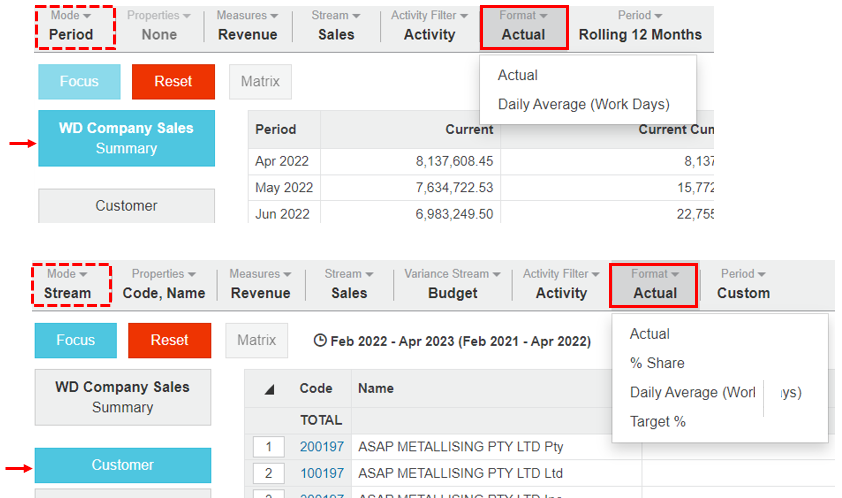
The format options that are available depend on what mode you are using and whether or not you have selected a dimension, as illustrated in the images below.

Actual
Actual is the default view for numerical data in Analytics, so this is what the data looks like before you apply any of the other formatting options. It displays the data in its original, default form in the columns in the grid.
Daily Average
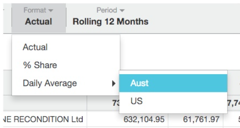
The Daily Average format replaces ‘actual’ data with a daily average, typically based on number of calendar days in each time unit. If your administrator has set working days calendars for your organization, you will see additional options appear from the Daily Average menu. These calendars are typically set up to align with your country's public holidays, half day holidays and so on. For example, you might have a calendar with working days only for Australia.
The daily average does not include the data from the current day. This is by design because 'today’ is not finished yet.
Example - Compare the daily average sales
In the Sales database, change the format to help you compare the daily average sales for February, March and April.
Click the Customer dimension.
Apply a custom period: Start in February and end in April.
Click Format > Daily Average. In this example, there are no working day calendars to select from*. The grid updates to show the daily average in each month based on the total number of work days in each respective month. The number of work days displays in brackets in each column heading.

*Suppose there were working day calendars to select from. You would click the Format menu and hover over the Daily Average option to display the options, then select the required calendar, such as Aust (Australia).

% Share
The % Share format displays the data as a percentage of the total, with each column totaling 100%. Share is calculated as a percentage of records in the current view. Percentage share becomes available when a dimension is selected.
Example - View what percentage each customer contributes to profit
In the Sales database, change the format to view what percentage each customer contributes to the profit.
Click the Customer dimension.
Click Measure > Profit.
Click Format > % Share. The grid updates to show the percentage share for each customer, with the values in each column adding to 100%.

| Tip |
|---|
To change back to dollar amounts, click Format > Actual. |
Target %
The Target % options is available in Stream mode, when a dimension is selected. It replaces the data in the Variance % column with a target %, where Target % = Stream/Variance Stream. It is often used to measure how close the sales are to the budget as a percentage.
| Tip |
|---|
The bullet chart always displays the target %, even when this is not displayed in the grid. |
Example - Analyze performance against budget
In the Sales database, change the format to help you analyze how four states are performing against the budget for the year.
Click the Country dimension, then select and focus on the US.
Click the Territory dimension, sort by local value in descending order, then select and focus on the top four states (CA, TX, FL and MA).
Click Mode > Stream, then click Stream > Sales and Variance Stream > Budget.
Click Period > Rolling 12 months. As expected with Stream mode in a filtered view, the
 Budgets variance columns display the variance and percentage variance, so you can see how each state is performing against the budget. For example, you can say that California achieved -0.79% of its budget. This is difficult to judge, so you want to see this variance from a different perspective…
Click Format > Target %. The grid updates to show the target % in the Budgets percentage variance column, giving you a difference perspective on the results. For example, you can now say that California achieved over 99% of its budget.
