Most of the chart types have configuration settings on the left side that you can use to customize your view of the chart. The available settings depend on the type of chart and might include one or more of the settings listed (in alphabetical order) below.
| Expand | ||
|---|---|---|
| ||
Scales the chart based on the values graphed rather than starting at zero. The chart axis starts from the lowest data point in the chart, rather than zero. This starting point creates a more meaningful chart when all values are high. Example - A simple chart with auto axis scale In the image below, the Auto Axis Scale checkbox is NOT selected, therefore, the Y-axis of the chart starts at zero. As a result, the difference between the high values can be difficult to determine. 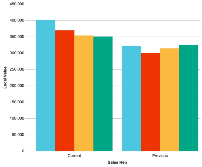 As you can see in the image below, when the Auto Axis Scale checkbox is selected, the Y-axis of the chart starts at approximately 110,000, the lowest data point in the chart. As a result, it is easier to see the difference in values. 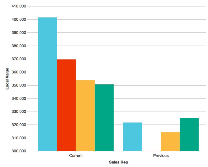 |
| Expand | ||
|---|---|---|
| ||
Allows you to change the colors in the chart. |
| Expand | ||
|---|---|---|
| ||
Visually compares two measures with different measurement scales, such as value and margin. Typically, the left Y-axis displays the first measure and the right Y-axis displays the second measure. Example - Add a second axis to a chart
In the image below, the Dual Axis checkboxhas been selected to display financial YTD sales value and profit on the same chart for a group of sales reps. 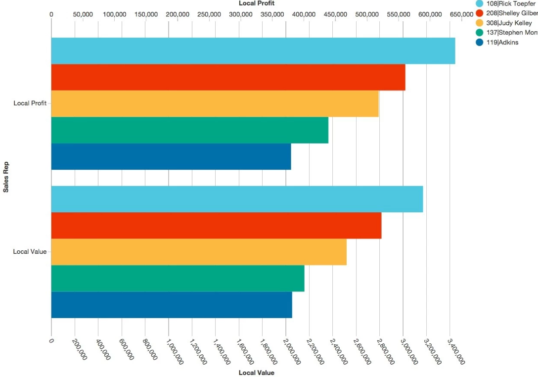 Here is what the chart looks like when the setting is not selected. 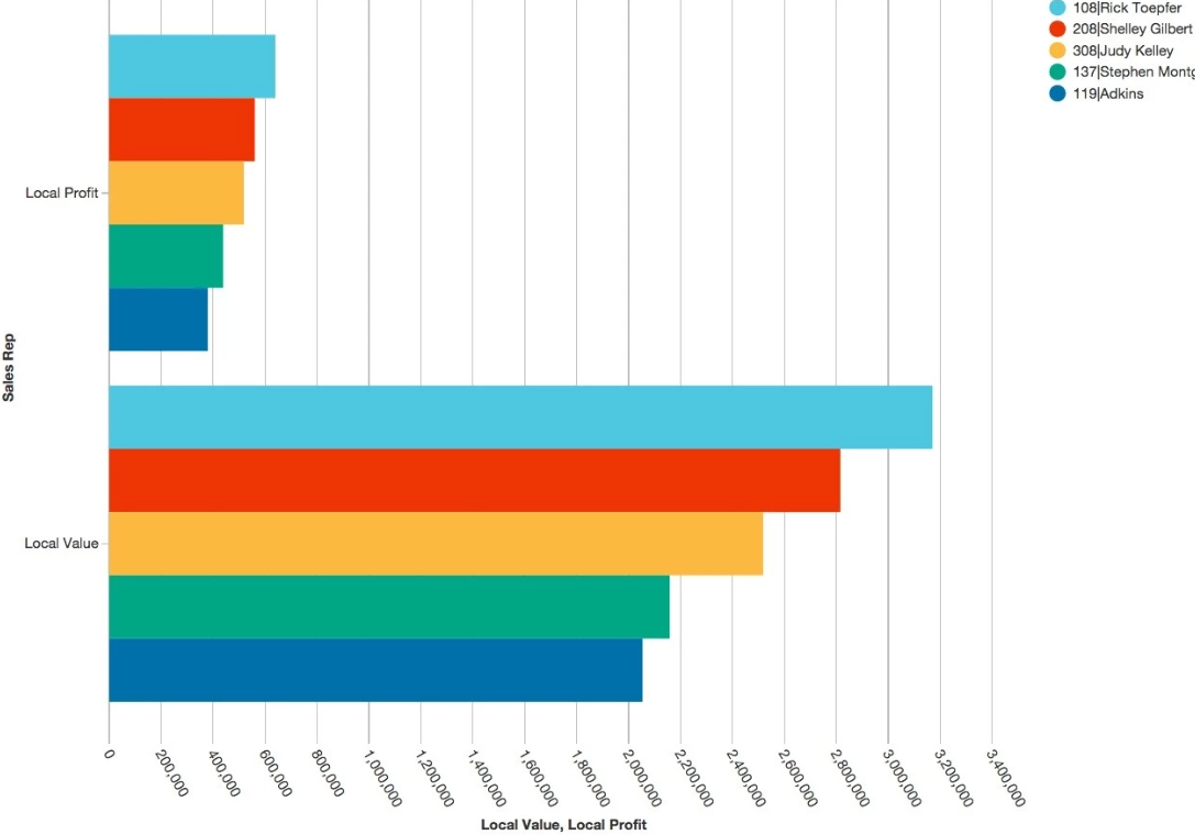 |
| Expand | ||
|---|---|---|
| ||
Applicable only when you select a day type of period from the Period menu, allows you to apply a working day calendar to the data in the chart to remove data for non-working days. See Create a line chart that displays data for working days only. |
| Expand | ||
|---|---|---|
| ||
Options for repositioning the legend or hiding the chart from view. See Use the chart legend. |
| Expand | ||
|---|---|---|
| ||
Descriptive text that displays on the chart, either before or after the number, gives the number more context.  |
| Expand | ||
|---|---|---|
| ||
The lower and upper limits that you want the range to span. The range is 0 and 100 by default, but you can change this. |
| Expand | ||||
|---|---|---|---|---|
| ||||
Conditional color coding that you can apply to the chart. By default, there is no color coding applied but you can enter a range for each color. For example, on a Gauge chart, the pointer might be in the red or yellow zone until a target is met or exceeded, at which point it will be in the green zone. In a Summary chart, the summary might display in red or yellow until a target is met or exceeded, at which point it will turn green.
|
| Expand | ||
|---|---|---|
| ||
Displays extra details on the chart. For example, you might want to display the figures behind an improvement or decline in performance. When this option is selected, the actual and variance or target values are displayed underneath the chart. This is particularly useful on a dashboard, as you can see the figures behind an improvement or decline in performance, without needing to open the widget. When this option is not selected, you get a basic gauge that displays only the variance amount. |
| Expand | ||
|---|---|---|
| ||
Displays the data point values inside the chart, so you don’t need to hover over the data points to display the values. |
| Expand | ||
|---|---|---|
| ||
Useful when the legend title has long text, as you can opt to display the full text or not. |
| Expand | ||
|---|---|---|
| ||
Displays only one tooltip at a time when you hover over a data point in the chart. This is a good feature if you want to focus on a single data point and view more details about a single value. |
| Expand | ||
|---|---|---|
| ||
Depicts the values stacked on top of each other rather than side by side. Groups all selected dimensions into a single bar. Example - View percentage split for products The stacked option is particularly useful when viewing a matrix share. In the image below the Stacked checkbox has been selected. As a result, you can see the percentage split for products in three categories is displayed on top of each other. 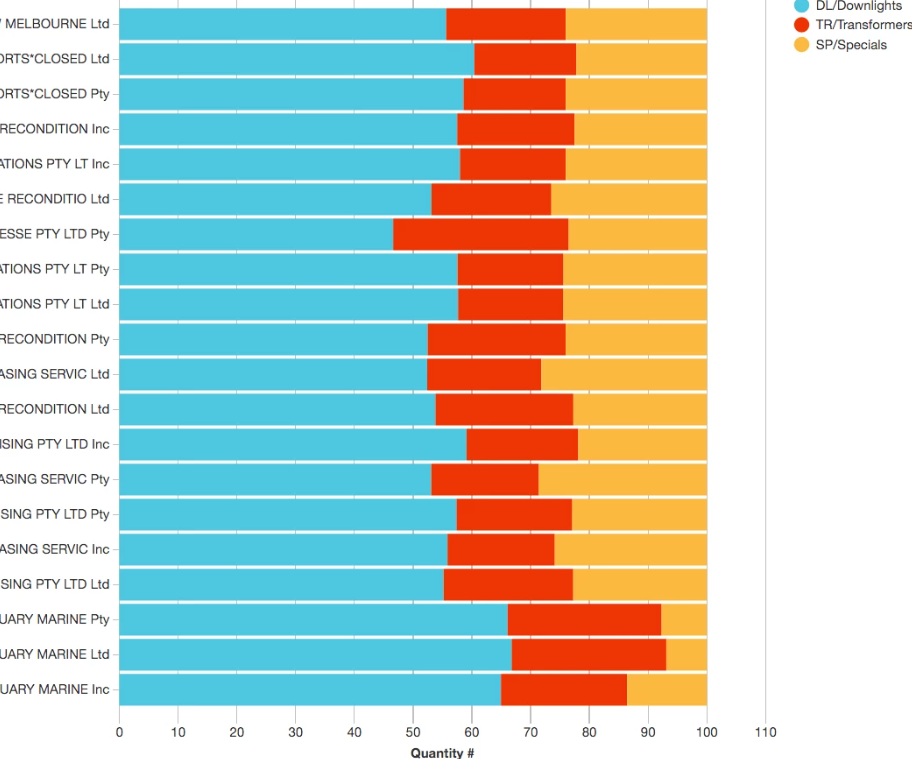 |
| Expand | ||
|---|---|---|
| ||
Renders the lines between each point as straight rather than curved. |
| Expand | ||||
|---|---|---|---|---|
| ||||
The type of result that you want to appear in the chart. The options that are available in the Summary menu depend on the selected mode and other settings but the full list is as follows:
|
| Expand | ||
|---|---|---|
| ||
Adds visual elements to the chart which are used alongside the conditional color coding you apply. You can select from the following options: Smiley  Traffic Lights  Emojis  Arrows  |
| Expand | ||
|---|---|---|
| ||
Superimposes a line on a chart revealing the overall direction of the data. Depicts a momentum indicator for each series. Example - View trends in product sales In the image below, the Trend Line checkbox has been selected. As a result, the trendline shows the general direction of sales for two product classes over a rolling 12-month period. 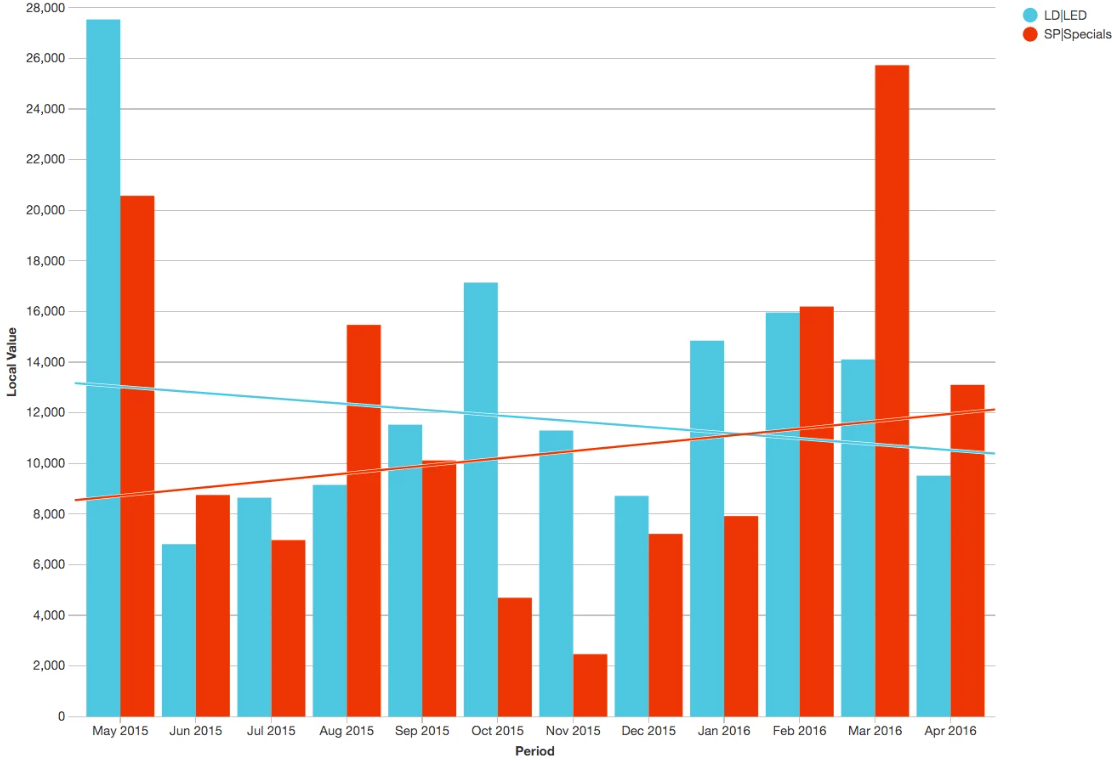 |
| Expand | ||
|---|---|---|
| ||
Charts the accumulated total rather than individual values. In other words, rather than charting current vs. previous for each time unit, Phocas charts current cumulative vs. previous cumulative for each time unit. Example - View cumulative data In the following image, the Use Cumulative checkbox is selected and as a result, the accumulated total value is displayed for each month. 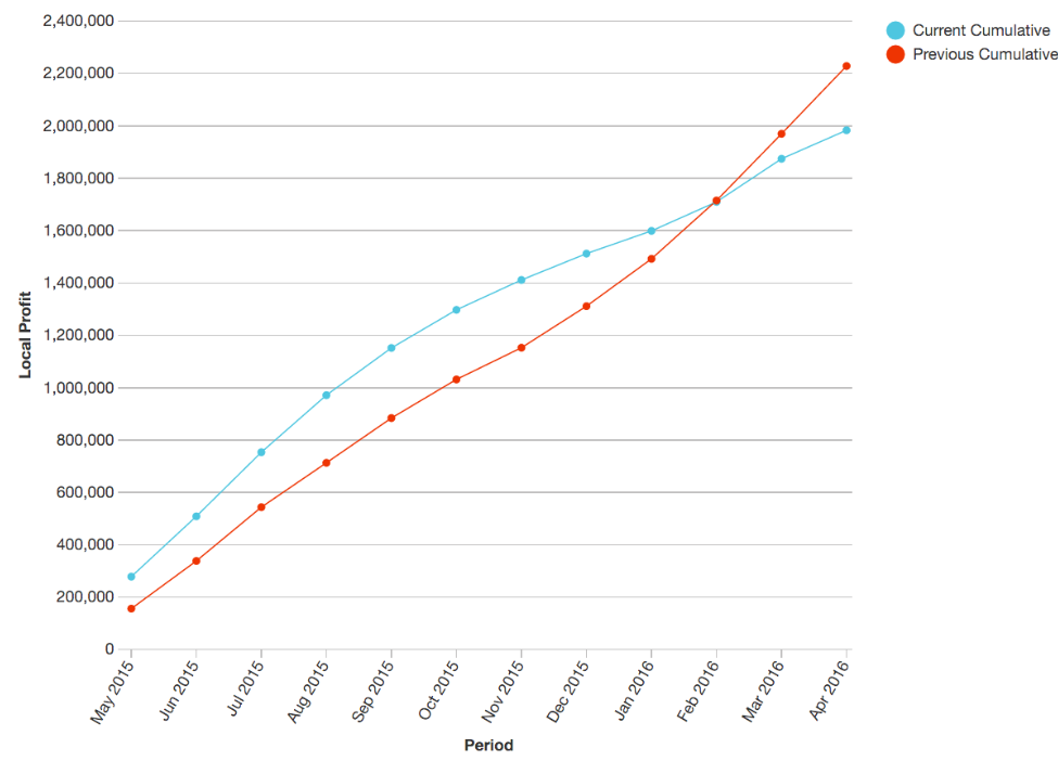 |
| Expand | ||
|---|---|---|
| ||
Charts the sum rather than individual values. Summarises period values into a single bar. In other words, the total for each period is charted rather than all focused items. Example - Simplify a chart by showing totals only A Column chart was created based on 11 focused customers over 12 months. The Use Total checkbox is NOT selected and as a result, the customers are each shown as different colored bars in each month. 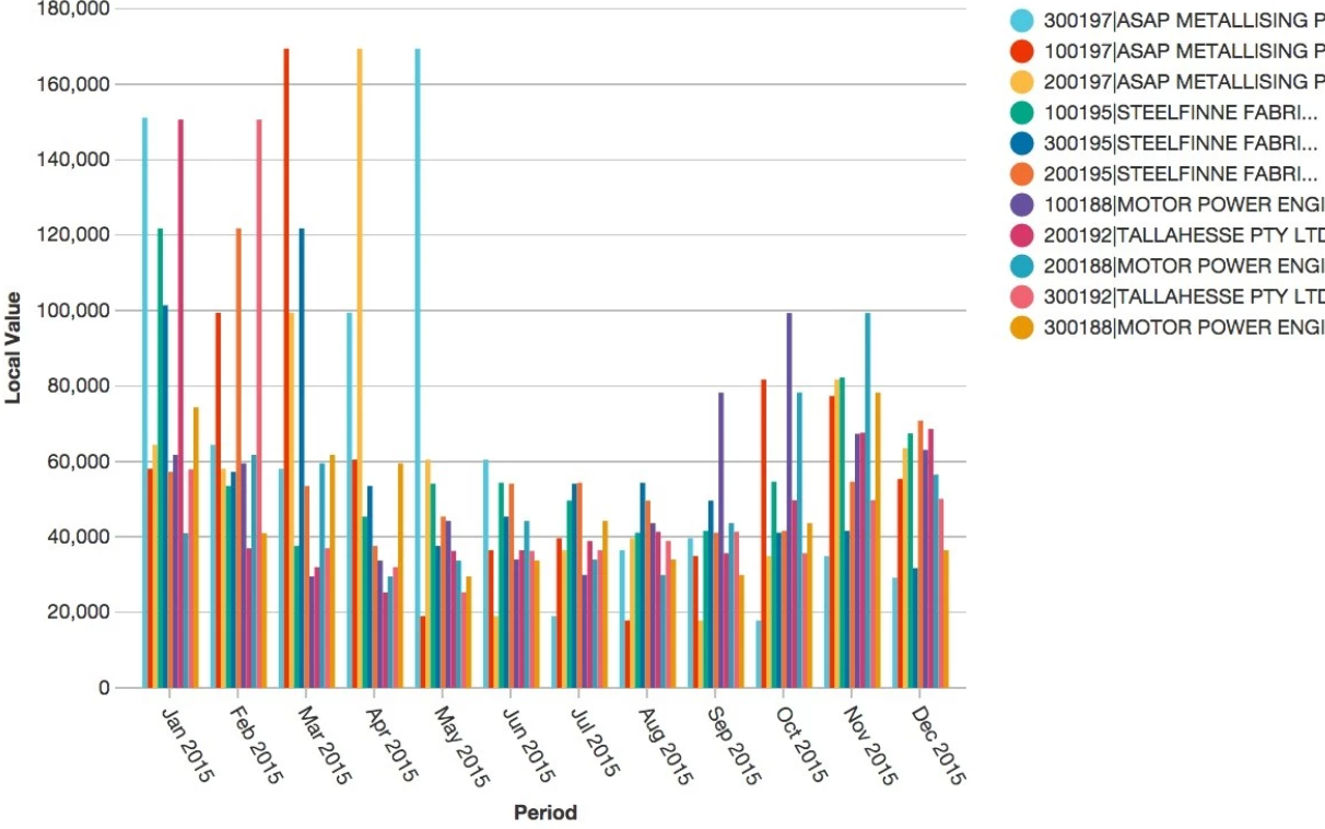 When the Use Total checkbox is selected, the combined total monthly value of the 11 customers is represented by a single bar for each month. 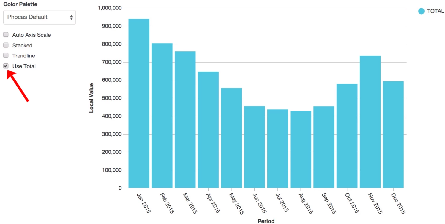 |