You can visually Visually explore and interact with your financial information in a chart format. Switch between different types of charts and configure how the data displays in each one. Select different rows of data and watch the chart instantly update. Add the chart to a dashboard to share key metrics with your team.
Charts are available in all financial statements except for the Trial Balance and they work and they work well alongside the levels and column groups features. Charts are particularly useful when the statement grid has a lot of columns and you are only interested in one row or a few rows - rather than scrolling across multiple columns, you can visualize the row(s) instead.
You can switch between different types of charts and configure how the data displays in each one. You can select different rows of data and watch the chart instantly update. You can add the chart to a dashboard or display it in full screen mode, which is useful during presentations.
You can then add the chart as a widget on a dashboard.
Open the chart pane
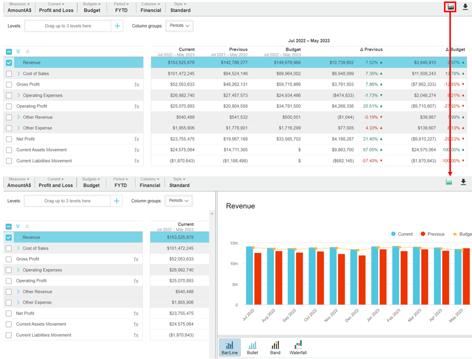
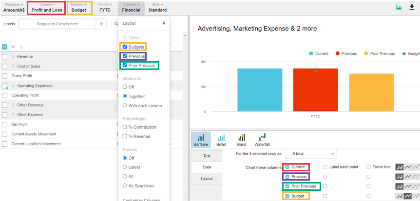
In any financial statement, select the row(s) of data that you want to view in the chart. If you do not select any rows, by default, the first row is selected for you.Click the Chart button in the top right corner above the grid. The chart pane slides out from the right of the screen, displaying data for the selected row(s) and the Chart button turns green.
You can then proceed to interact with the chart, such as select different rows to view different data and customize the chart to match your required analysis.
If you did not have any rows selected, by default, the first row is selected for you.
The chart panel is split into two parts; the chart at the top and the configuration options underneath.
Interact with the grid and chart
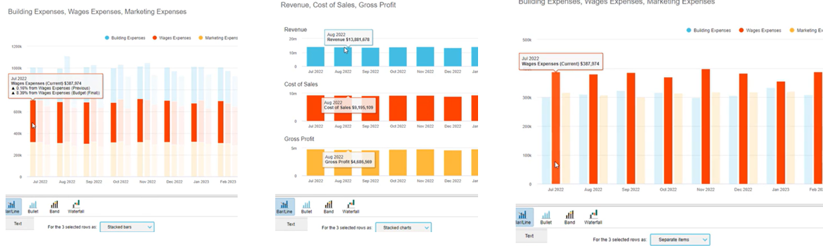
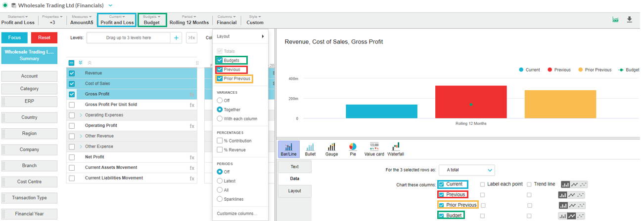
The chart panel sits to the right of the grid, as illustrated in the image above, so you can view the data in two formats at the same time, and interact with them simultaneously. Actions you You can take the following actions:
Scroll across the grid to view the data on the far right whilst keeping the chart in view. If you want a better view of the grid and a minimal view of the chart panel or vice versa, click and drag the divider to the left or right as required.
Select one or more rows in the grid and the chart will update accordingly. The chart’s Data tab gives you options for dealing with multiple rows. See Select and focus on accounts and groups in a financial statement to learn about the different ways to select rows.
Click an item in the chart legend to remove the corresponding data from the chart, then click the legend item again to display it in the chart. For example, if your chart displays the current, previous, and budget data streams, you might want to remove the previous stream, so you can compare the current and budget more easily.
Change your view of the grid , such as apply a different period, and and watch the chart will update accordingly. You Your row selections are retained. For example, you might want to apply a different period or display all periods. See Change your view of a financial statement to learn about the different ways to change the layout and the contents of a statement.

Customize Change the chart type and configure the chart options (see below).
Change the chart
The chart panel is split into two parts - the chart at the top and the configuration options underneath. You can select from a range of chart types, each with their own configuration options. As you try out the different chart types and options, the chart renders responsively. This interaction helps you find the chart type and configuration combination that best meets your analysis requirements.
Change the chart type
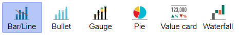
Depending on the row(s) of data you selected, there are four types of charts you can applytype
Click the buttons below the chart to instantly switch to a different type of chart: Bar/Line, Bullet, Gauge, Pie (Donut), Value card, and Waterfall. Click the buttons below the chart to instantly switch between the available chart types.
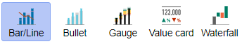
When you change the chart type, the chart configuration options change accordingly.
Phocas remembers the last chart type you used, so the next time you open the
achart pane, the same chart type is automatically applied.
You can easily switch to a different chart type.When you change the chart type, the chart configuration options change accordingly.
Configure the chart options
A range of chart configuration options are available for each chart, organized into three tabs. As you try out the different options, the chart updates accordingly. This interaction helps you find the chart type and configuration combination that best meets your analysis requirements.
Text
The text settings are available for all chart types. :
Title - You can edit Edit the default title, which automatically comes from the selected row(s).
Description - You can add Add a description of the chart, which displays as a subtitle. You can use this area to add commentary about the financial information, for example “in “in line with prior year”year”. This information displays wherever the chart ends up, such as a dashboard , slideshow or favorite.
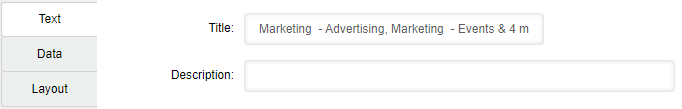
Data
The available data options that are available depend on the chart type you selected. Expand the sections below for information on each setting.
| Expand | ||
|---|---|---|
| ||
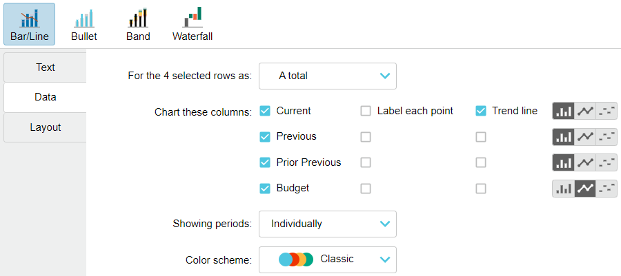
Determine how to treat the values in the selected rows. This option is available when you select multiple rows in the grid. The count of the selected rows is specified in the setting label.
|
| Expand | ||
|---|---|---|
| ||
Determine the data streams that display in the chart for the selected row(s). The available options that are available depend on the columns you have enabled in the grid.
  |
| Expand | ||
|---|---|---|
| ||
Add label data points to the data streams. This setting is available when you enable a data stream to display in the chart (above setting).
|
| Expand | ||
|---|---|---|
| ||
Add trend lines to the data streams. This setting is available when you enable a data stream to display in the chart (above setting). |
| Expand | ||
|---|---|---|
| ||
Select the comparison data stream and either:
|
| Expand | ||
|---|---|---|
| ||
Determine whether the period displays individually or cumulatively. |
| Expand | ||
|---|---|---|
| ||
Select the color scheme that applies to the chart. |
| Expand | ||
|---|---|---|
| ||
Select the color for the Total column: Classic (default light blue), Grey, Blue or Purple. |
| Expand | ||
|---|---|---|
| ||
Add a marker line that indicates the selected comparison stream value. |
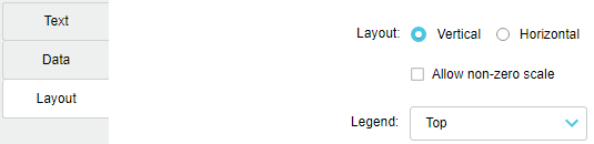
Layout
The layout settings are available for all chart types. You can:
Switch between a vertical (default) or horizontal layout of the bars in the chart.
Allow non-zero scale in the chart. When selected, this setting takes off the zero scale, to highlight the differences or emphasize trends. Not available in the Waterfall chart.
Change the location of the chart legend. By default, it displays in the top right corner but you can move this to the right of the chart or remove it altogether.
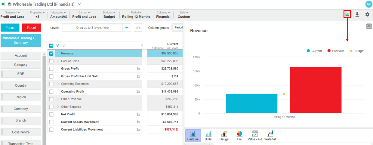
View the chart in full-screen mode
You might want to view a chart in a larger scale if you are using it in a presentation, so the audience can see the data more clearly.
Click the Full screen button on the top right of the chart pane. To exit out of full-screen mode, press the Esc key.
Add the chart to a dashboard
See Add financial analysis to a dashboard.
Close the chart
panelpane
Click the Chart button in the top right corner to hide the chart panel from view.
On this page
| Table of Contents | ||||
|---|---|---|---|---|
|
Related page
| Panel | ||
|---|---|---|
| ||
Videos |