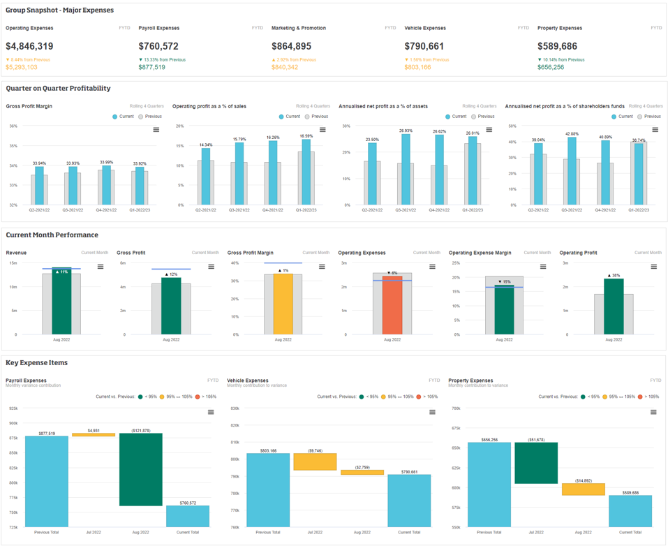
Dashboards provide powerful insights and overviews of your financial information in one place, making it easy to get quick answers and insights, and monitor performance. Dashboards are made up of lines, in which you can have a range of widgets from different financial statements. For example, you can use different widgets to visualize KPIs and financial ratios that are meaningful to a wide range of audiences. You can also include non-financial metrics to provide context to your financial data and enable a greater understanding.
| Expand | ||
|---|---|---|
| ||
 |
Learn about what can you add to a dashboard
You can add the following types of content to a dashboard. Displaying the information in different ways often makes it easier to consume.
Grid view - When you change your view of a financial statement to meet your specific needs, you can add that view as a widget on a dashboard. You can also add your favorite views to the dashboard.
Chart - When you view your financial information in a chart format, you can add the chart as a widget on a dashboard. As periods are included in charts, the chart widget is a complex visualization that provides a powerful way to visualize changes and trends in data over time. When you hover over a value in the chart, a tooltip displays with data, including the variance.
Value widget - You can create value widgets to add to a dashboard. These look like card - A Value card is a special type of chart, similar to the Summary chart types available in the Analytics module. Periods are not included, so the value widget is a simple visualization that . It displays a value for the current period, and the corresponding value from the previous period and/or budget for comparison purposes. It is a useful tool for visualizing your key financial metrics, such as your gross profit margin.
Add a grid view to a dashboard
Change your view of the financial statement grid to display the required information. Alternatively, you can open a favorite view, if applicable.
Click the blue arrow next to the database name and select Add to dashboard.

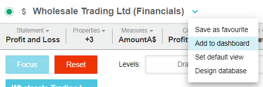
Select one of these options:
Add the widget to an existing dashboard: Select an existing dashboard, and the specific line in that dashboard, in which to display the widget.
Add the widget to a new dashboard: Select the New option from the list, then enter a name for the dashboard and line. Enter a description, if required.
Click Save & Open to see what the widget looks like on the dashboard.
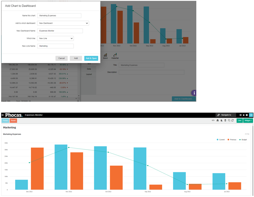
Add a chart or Value card to a dashboard
tipThe following steps apply to adding a chart to a dashboard from within the chart pane. See Create a value widget section below to learn how to add a summary value to the dashboard.
Create the chart. See View financial information in a chart for detailed information. or Value card.
Click the Add to Dashboard… button in the bottom right of the chart panel.
Edit the chart name, if required.
Select the dashboard on which you want to add the chart or select New Dashboard and enter a name for that dashboard.
Select the line in the dashboard in which you want to display the chart as a widget. If you are creating a new dashboard, enter a name for the line.
Select one of these options:
Click Add if you want to add the chart to the dashboard and continue working with the grid and chart panel. This option is useful if you want to add other charts.
Click Add and Open if you want to add the chart to the dashboard and open the dashboard. This option is useful when you are ready to see what the chart looks like on the dashboard.
Add a value widget to a dashboard
The value widget option is available in a financial statement when the Columns > Periods > Off option is selected, as illustrated by scenario 1 in the image below. When Columns > Periods > All is selected, the chart pane (see section above) opens instead, as illustrated by scenario 2 in the image below.

With the Columns > Periods > Off option selected, right-click a row in the financial statement, then click Visualize.

Customize the default value widget to suit your needs. For example, you can add a more meaningful name, select a comparison data stream and apply conditional formatting. What you can do exactly depends on the setup of the underlying the financial statement, such as the period and columns that are selected.
Name - Enter the name of the widget.
Description - Enter a description of the widget. You can use this area to add commentary about the financial information, for example “in line with prior year”.
Data value (Below the current value…) - Determine the data that displays in the widget. The data stream options that are available depend on the columns you enabled in the grid. By default, each data stream is included but you can clear the checkboxes of those you don’t want to include.

Conditional formatting - Apply a color to the information based on rules. Color coding helps you to quickly identify is a value is good or bad. Select the conditional formatting checkbox to display the settings, then specify when a value is a better result (Higher, Lower or Closer) and enter the percentage parameters. For example, the more revenue you have the better it is, so if there is a 10% increase in the revenue value it displays in green, if there is a 10% decrease it displays in red and if there is any other movement within the 10% range it displays in yellow. You can apply different conditional formatting to each data stream.

Prefix and Suffix - Add additional details before (prefix) or after (suffix) the current value in the visualization. For example, you might want to add the currency before the value, such as USD $27,984,894.
On the right-hand side of the widget, select one of these options:
Add the widget to an existing dashboard: Select an existing dashboard, and the specific line in that dashboard, in which to display the widget.
Add the widget to a new dashboard: Select the create a new dashboard option from the list, then enter a name for the dashboard and line.
Click Add & Open to see what the widget looks like on the dashboard.
Examples
In the following examples, four widgets are added to the same line in a new dashboard. Expand each widget section to view its setup.

| Expand | ||
|---|---|---|
| ||
 |
| Expand | ||
|---|---|---|
| ||
 |
| Expand | ||
|---|---|---|
| ||

|
| Expand | ||
|---|---|---|
| ||
 |
Edit a dashboard widget
You can edit any of the Financial Statement widgets that you add to a dashboard. This action is available for all grid views and trend-based charts, including the value widgets that were created using the right-click > Visualize method.
On the dashboard, hover over the widget and click the Edit button that displays in the header bar. Make your changes, then click Save.

On this page
| Table of Contents | ||||
|---|---|---|---|---|
|
| Panel | ||
|---|---|---|
| ||
Related pagesDashboards are one of the key features of Phocas and are available across all modules. See the Dashboards section of this help center to learn more. |
| Panel | ||
|---|---|---|
| ||
Video |